CSS Flexbox Vs Float Vs Grid
In this article, we shall in depth understand the different CSS layout techniques.
CSS Flex-Box
The Flexible Box Layout Module, makes it easier to design flexible responsive layout structure without using float or positioning.
CSS for whole container
display: flexbox | inline-flex;
flex-direction: row | row-reverse | column | column-reverse;
flex-wrap: nowrap | wrap | wrap-reverse;
flex-flow: <‘flex-direction’> || <‘flex-wrap’>
justify-content: flex-start | flex-end | center | space-between | space-around;
align-items: flex-start | flex-end | center | baseline | stretch;
align-content: flex-start | flex-end | center | space-between | space-around | stretch;
CSS for items in a container
order: <integer>;
flex-grow: <number>; /* default 0 */
flex-shrink: <number>; /* default 1 */
flex-basis: <length> | auto; /* default auto */
flex: none | [ <'flex-grow'> <'flex-shrink'>? || <'flex-basis'> ]
align-self: auto | flex-start | flex-end | center | baseline | stretch;
Property #1:**display: flex**
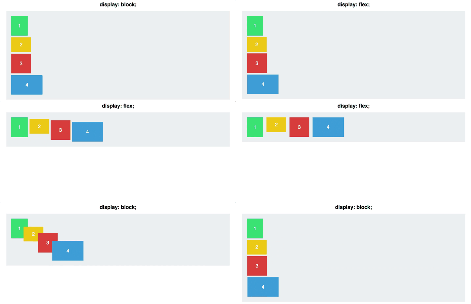
A container’s default display: block in this context, display: flex tells your browser ‘’I want to make this container flexible.’’
Source: Scott Domes
Initially, each of the four containers (green, orange, red, blue) are defaulted with display: block thereby take all space from right to left.
Property#2:**Flex direction**

Flexbox terminology diagram from official W3C specification.
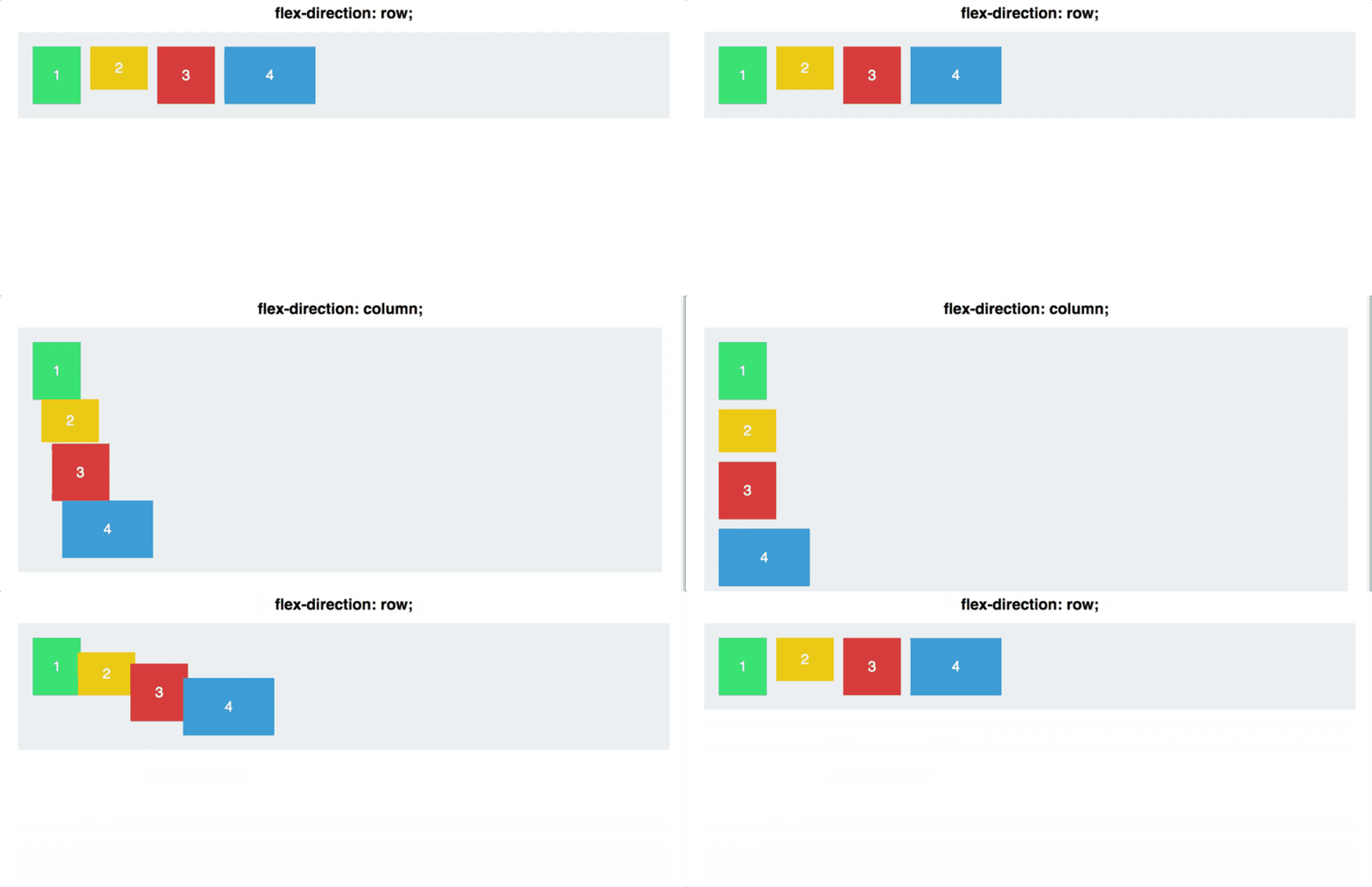
On application of flex property, we create a flexbox with two axes as showed above. This is why your squares defaulted to a horizontal line once you applied display: flex.
#container { display: flex; flex-direction: column;}
Source: Scott Domes
flex-direction: column is an interesting property in that it doesn’t align content on the cross axis instead of main axis. It alters the main axis from horizontal to vertical.
Property#3:Justify content
Justify content determines how items are aligned along the main axis. Attributes include; Flex-start: Flex-end, Center, Space-between (gives equal space between each square, but not between it and the container), Space-around(puts an equal space on either side of the square).
#container { display: flex; flex-direction: row; justify-content: flex-start;}
Source: Scott Domes
Property#4:Align items
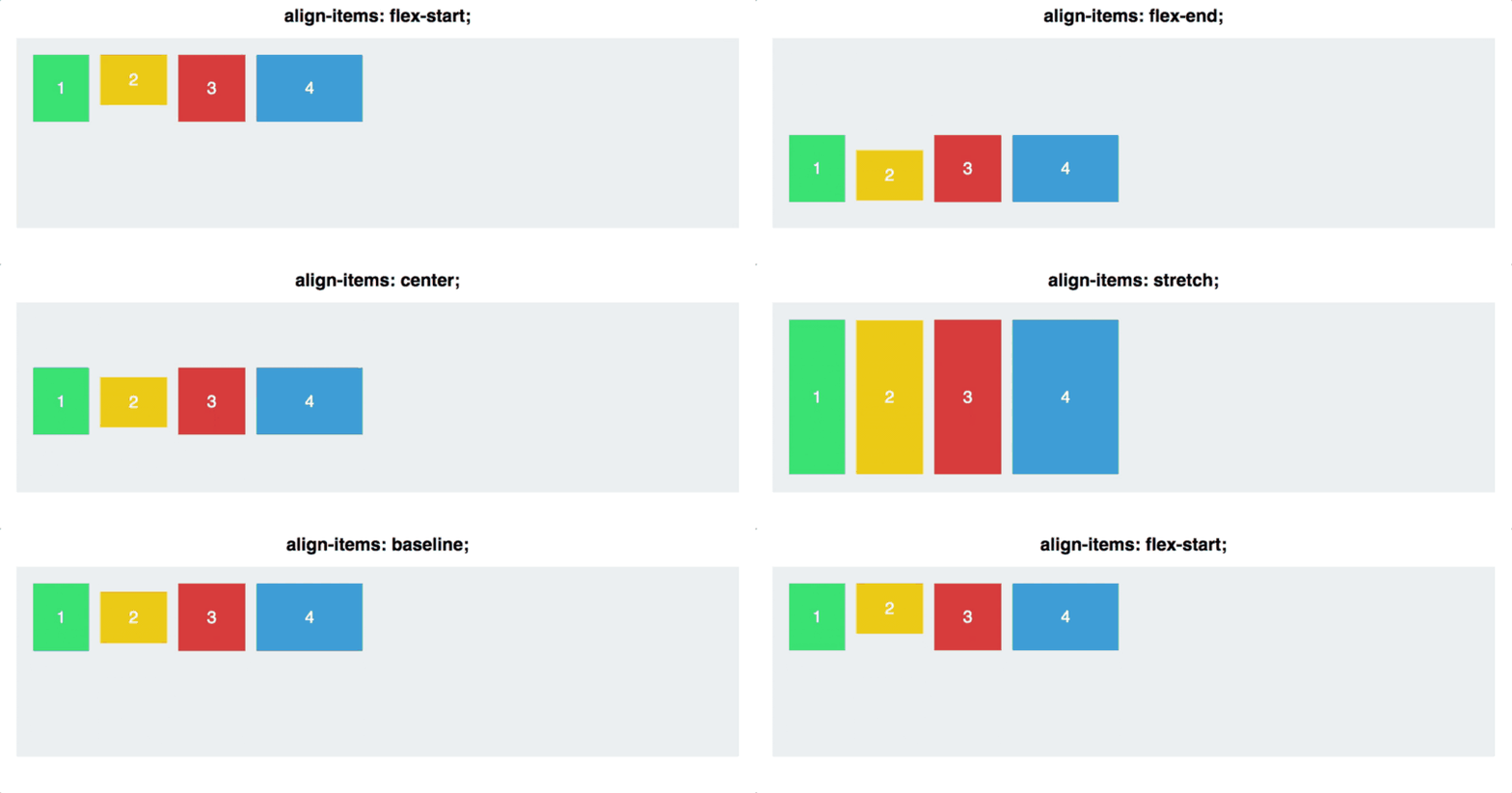
With a recap from justify-content that works applies to the main axis, align-items applies to the cross axis. flex-start, flex-end, center, stretch(items take up the entirety of the cross-axis), baseline(bottom of the paragraph tags are aligned).
Source: Scott Domes

Source: Scott Domes
Property#5: Align self
Align-self property helps us to align individual items thereby overriding the align-items though it follows the rule for the entire container.#container { align-items: flex-start;}.square#one { align-self: center;}// Only this square will be centered.
Source: Scott Domes
CSS Float
When we add float: left; to a container, the elements will be positioned to the left of the other .

before

after
Further more, when we add float: right; to the float items, they will be to the right of the containers and side by side to each other from right to the left.
The most applicable use of floats is when designing a navigation bar.
CSS Griddisplay: grid; is newest and most powerful layout system in CSS. It offers 2-dimensional layouts thereby you handles both rows and columns unlike flexbox which is largely 1-dimensional. You work with Grid layout by applying CSS rules to both the parent element (which becomes the Grid Container) and to its children (which become the Grid Items).
Grid Container
`grid-container {  display: grid | inline-grid }
grid-template-rows { <integer> <integer> } /**specifies number of columns **/
gird-template-columns { <integer> <integer> <integer> <integer> }` /\*\* specifies number of columns \*\*/
justify-content { space-evenly | space-between | center | end }
align-content { center | space-evenly | space-around | space-between | start | end }
When you assign the display property of a container to grid , every element in it becomes a grid item.
Conclusion
Besides the above explained CSS layout techniques, you can use CSS libraries such as Bootstrap, Material UI, Semantic UI, etc. to make web pages responsive.
references: w3schools , css-tricks.com
